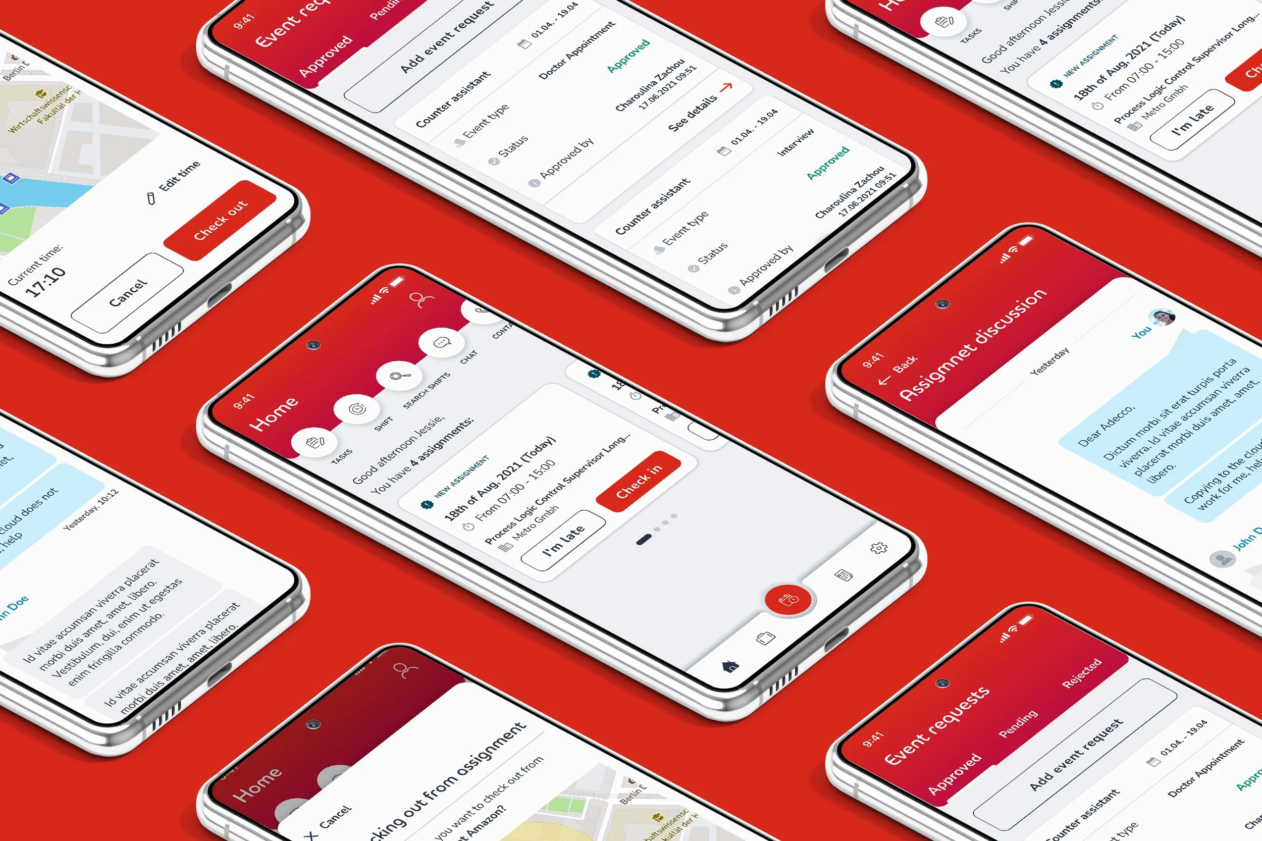
Time & Attendance
- PROJECT NAME
Time & Attendance- PRODUCT CATEGORY
Human Resource - Corporate solutions- DATE
2021- DURATION
8 monthsAbout the project
Time & Attendance is part of the corporate products aimed at employees & employers providing solutions for checking in to shifts, submitting timesheets and requesting events.
Product was primarily structured for native mobile use, but corresponding web admin panel was simultaneously in development.
Premise & My role
I was contracted by Adecco to join a team of product designers in this exciting project. The product was a part of number of enterprise solutions and had an old version with many usability problems that needed to be solved from ground up.
roleI was part of the 5 people team involved throughout the whole process of product development. I had my part in doing qualitative research, updating and organizing the design system, producing viable design ideas, prototyping and reviewing the usability heuretics.
The design systemDesign system was all over the place, challenge of keeping the design system up to date was in the same alley as building the actual product. We came up with 80-20 rule, giving 80% of our time to the actual product and 20% to the design system.
Part of the Design system
Goals
· Making the checking in experience more intuitive
· Redesigning the app using the updated system
· Appshell cohesion with existing products
· Improving the usability and information architecture
The goal was to make the check in experience better in all use cases.
Challenges
· Getting user insights from both employers and employees
· Limitation in visual redesign due to obligatory use of existing appshell
· Pressure of decision making from stakeholders and solution architects
Framework
We moved back and forth among the phases as the design process was not linear.
Discovery
Understanding Target UsersDefining who we're designing for helped us understand the needs of the users who will regularly use the app.
We worked with customer support team on getting a hold of users who used the previous version of app.
Insights were additionally aligned with business goals from stakeholders.
Insights· Multiple ways of checking in should be provided - QR, Selfie checkin etc
· Timesheet overview should be easily scannable
· Submitting requests should be available with predefined types (vacation, sick leave etc…)
Information architecture & documentation flowchart
Exploring design treatments
We explored a variety of design treatments to find opportunities to make managing checking in assignments easier and with proper micro design feedbacks.
Checking in
Different employers needed different ways of checking in. We tackled these with 4 different variations:
checking inside of zone
checking in with QR Code
checking in with selfie
outlier when trying to check in outside of zone
Checking in with QR Code
Specific option needs to be triggered from admin panel by the employer.
Checking in with selfie
Bubble navigations
We used a top bubble navigation due to excess need of secondary level navigation. Some of the options were leading to other products which are in function inherently connected but due to technical limitation (iFrame), could not be incorporated into core navigation of the app ( suck as tasks and shifts which are products of its own).
Secondary level items
Overview of event requests
Timesheet flow
Sneak peak at admin dashboard solutions
Bucketload of artboards
Important to notice that due to sheer amount of different case scenarios, dozen types of different tasks, assigments, event request etc… this is just a showing of core solution to most important flows.
Usability testings & heuristic assesment
We did a remote usability testing with 8 different users focusing on 4 main tasks:
checking in inside of zone
submitting an event request
filtering a timesheet from 2 months ago, editing and resubmitting
uploading different types of media in “media tasks”
Insights we gathered:
all users reported that timesheet overview page is not “scanable” enough
ux writing of different type of event request was not clear
users wanted to filter timesheet by certain date periods
Heuristic assessment
We did an evaluation of 10 usability guidelines by Jacob Nielsen rating the sections by the scoring system below.
After going through with the first assessment and agreeing on the issues, we jumped to the improvements and final assessment lead us to high usability score with few minor usability issues.
Final thoughts
The complexity of project mostly rooted from having to deal with different squads of devs and project managers, as well buying the time to do the research parts and assess the usability issues, as well the roadmap of improvements.
What would I do differently ?
In perfect case scenario, not having the limiting factor of using the existing app sheel that’s used throughout other products would grant more freedom of laying out information architecture in a different way.
Also the inevitable use of iFrame for linking to other products is inherently a bad user experience, but it was a set in stone decision due to technical and financial restrictions.


